Process

The latest project in e-Com is designing a personal logo. First, I started by writing my name in different ways like in cursive, my normal handwriting, and trying to mimic other fonts. Then I started drawing shapes around my name. I decided my name was too big for a logo, so I went with my initials. After three pages of sketching, I decided to write my cursive initials in a circle. I then worked on my logo in Adobe Illustrator. I first did it in black and white to make sure it looked good without any color. Once I was happy, I started adding color. The letters have a yellow outline, which, to me, makes it look like they are outlined in gold, and the circle is an red-orange color. I also tried outlining the letters in silver with the circle being blue or purple, but I decided to go with the gold and red-orange because it was bright and energetic. I then messed around with making the circle lighter or darker, and messed around with the letters. Some examples have the letters filled with a grey color with a yellow outline. I like a lot of the darker ones, but when making them smaller, it was hard to tell what it was, so I went with the red-orange circle with yellow outline on the letters.
 |
| Here is my new logo! |
Mockups

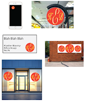
After I chose my logo, I then used the mockups my teacher let us use. A mockup is just an example someone can put their logo on. I decided to go with a round sign, business card, an iPhone app, a small billboard and a storefront. I only needed to do four, but I decided to do one more just to make sure I was happy with my logo. My logo looked good and I was happy with it, so this is my new logo. I chose warm colors because yellow is happy and energetic while red/orange added to that happy, bright, and energetic feel to the yellow letters. I also decided to go with cursive letters because cursive is very elegant and added some class to my logo.
 The latest project in e-Com is designing a personal logo. First, I started by writing my name in different ways like in cursive, my normal handwriting, and trying to mimic other fonts. Then I started drawing shapes around my name. I decided my name was too big for a logo, so I went with my initials. After three pages of sketching, I decided to write my cursive initials in a circle. I then worked on my logo in Adobe Illustrator. I first did it in black and white to make sure it looked good without any color. Once I was happy, I started adding color. The letters have a yellow outline, which, to me, makes it look like they are outlined in gold, and the circle is an red-orange color. I also tried outlining the letters in silver with the circle being blue or purple, but I decided to go with the gold and red-orange because it was bright and energetic. I then messed around with making the circle lighter or darker, and messed around with the letters. Some examples have the letters filled with a grey color with a yellow outline. I like a lot of the darker ones, but when making them smaller, it was hard to tell what it was, so I went with the red-orange circle with yellow outline on the letters.
 After I chose my logo, I then used the mockups my teacher let us use. A mockup is just an example someone can put their logo on. I decided to go with a round sign, business card, an iPhone app, a small billboard and a storefront. I only needed to do four, but I decided to do one more just to make sure I was happy with my logo. My logo looked good and I was happy with it, so this is my new logo. I chose warm colors because yellow is happy and energetic while red/orange added to that happy, bright, and energetic feel to the yellow letters. I also decided to go with cursive letters because cursive is very elegant and added some class to my logo.
No comments:
Post a Comment