 |
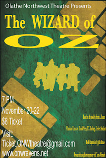
| Here is the poster I redesigned |
Contrast
- Used white and yellow to stand out from the backround
- "Oz" is bigger than everything else on the poster
- Credits are the smallest things on the poster
- Used different fonts
Alignment
- "Olathe Northwest" and "The Wizard of Oz" is aligned
- All the information relating to this event is all aligned
- Credits are aligned
Repetition
- Used Yellow for the Title and the credits
- "Olathe Northwest Theatre Presents" and all the information relating to this event are the same color
- The silhouettes of the main characters and the title are the same color
Proximity
- The title is together with the "Olathe Northwest Theatre Presents"
- All the information relating to this event are grouped together and are the same color
- Credits are grouped together with the same color and size