"Nature Man"
 This project was one of the first Photoshop Projects I did in my Graphic Design class. This project was to Photoshop a man, image was provided, into anything we wanted. The rules were the face had to be visible and use adjustment layers. I don't remember how long this project took me to complete, but longer than I thought. Some challenges for this project were deciding what I wanted to do. Originally, I was going to do a horror type edit, but decided to do a galaxy/alien edit instead. I had a a difficult time gettin the suit right, but figured it out in the end. I learned how to use adjustment layers and opacity as well as the quick select tool. Some feedback I got was the lack of blending modes. I didn't use any, in fact, due to my nonexistent experience with blending modes. To this day, I do think this edit is one of my best.
 Photoshop Challenge 2
This project was to find 5 photos or more, use a photoshop filter, adjustment layer, and a layer mask to create this edit. It took me a couple days, from what I remember, to complete it. I learned to use color balance/adjustment and how to layer photos together. Some challenges I faced were trying to make the gravestones look natural, getting the fox's orange color to stand out, but blend it, and for the statue/ghost thing in the background to be faint but noticeable. Some feedback I got was the gravestones looked a little distorted and the fox would look better if it had a shadow underneath it. I didn't make any changes to it since I turned it on to my teacher due to my satisfaction with my work. This project isn't my best work, but i do like the aesthetic it has. It's interesting.
Pop Art
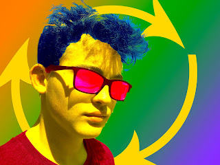
 The last project will mention is my pop art project. It didn't take me that long to complete, but i did have a difficult time getting the subject's hair blue due to all the little strays that were too small to color. I learned how to change backgrounds and change the color of a specific object. The feedback was it looked a little choppy, and I have to agree. I had a difficult time with the quick select tool in this project. Also, I could have used a better color scheme. I finished the main part of the project and didn't know what to do for the background, so I just guessed as to what to do and hoped it looked good. I already knew what I wanted to do when I put the photo in photoshop, but I was still learning the ropes of everything, and ended up with a decent piece of work. In my opinion, it's not bad, but not one of greater works.
 Time
Time
 |
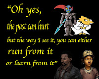
| One of the edits I made for my friend. She loves video games! |
 |
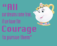
| This is another edit I made for a friend. She and I are in marching band! |
 |
| Eureka Springs. This is one of my better edits |
 |
| Stand By Me is one of my favorite movies, so I created this panama. |
Strengths and Weaknesses
I have strong time and project management skills as well as communication. However I lack in leaderships skills. Graphics Design doesn't have a lot of the traditional "leadership" roles, so it's been a bit of an adaptation. However, I always ask other for advice, and ask the teacher for help when I can't figure out a solution to a problem. I do turn in projects on time and make sure I am doing what is necessary to be on track.
Summary
What I love most about Graphic Design is the projects and how many we do. However, back to blending modes, I'd do a project where it was just blending modes as the main focus. Overall, the takeaway I had of this semester is to enjoy the projects and to do it how you feel like doing it while completing all the requirements. A goal for next semester is to continue side projects as well as keep up with schoolwork, which wasn't a problem this semester. Overall, I had good projects and poor projects, but none of them were terribly bad.
https://www.behance.net/katiebarry8d65
Behance
Below is a link to my Behance where you can check out more projects I have done as well as some other cool projects done by others:https://www.behance.net/katiebarry8d65
No comments:
Post a Comment